Why First Impressions Matter Online
We all do it. We arrive at a website, and if we don’t like what we see or can’t find what we want almost straight away, we leave. Why should we think our clients do any differently? The reality is, visitors judge your business within seconds based on what they find. In this blog we have put together some of our favourite website homepage tips for you.
Your website is a 24/7 storefront and often the very first place potential clients will discover you. It needs to tell your story, showcase your products and services, and do it all while looking polished, clean, and uncluttered. In those first few seconds, you want visitors to feel confident they’re in the right place, so they stick around to learn more. If your website feels out of date, confusing, or unprofessional, you’re likely losing business before you even know someone has visited.
Simple Website Homepage Tips to Make Your Site Shine
Whether you’re building your first website or giving your current one a refresh, there are some simple website homepage tips you can use right now to help your homepage stand out.
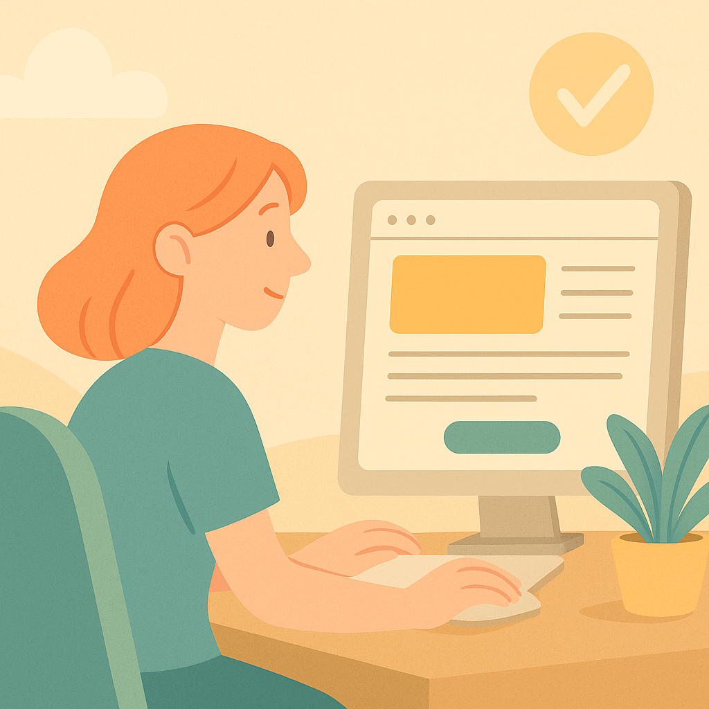
What’s the first thing you notice on a website?
Usually, it’s the hero image—the big banner at the top of the page. Choose a high-quality, on-brand image that instantly gives the right vibe. Your hero image should speak to your ideal client and set the tone for what they can expect. For example, if you’re a plumber, show your team on-site or solving a common plumbing issue. For a café, a photo of your best-seller and a welcoming smile behind the counter can work wonders.
If you don’t have professional photos, don’t stress—location-based imagery or well-chosen illustrations can also make an impact. Just make sure your images are crisp, not stretched or pixelated.
Next, look at your headline.
Is it clear and compelling? Can a visitor instantly tell what you do and who you help? If not, try rewriting it so there’s no confusion. Your headline should answer the visitor’s unspoken question: “Is this for me?” For example, instead of “Welcome to Our Site,” try “Fast, Reliable Plumbing in Newcastle—24/7 Emergency Service.”
Easy-to-find call-to-action (CTA) buttons are crucial.
Think “Book Now,” “Get Started,” or “Contact Us.” Place these where people can see them without scrolling, and make sure the language is clear and direct. A strong CTA helps visitors take the next step, whether it’s booking an appointment, requesting a quote, or simply getting in touch. Use contrasting colours for buttons to make them stand out (but always stay within your brand palette).
Consistency is key.
Stick to 2–3 brand colours and use easy-to-read fonts throughout your site. If you have a style guide, keep it handy for anyone working on your website to maintain that consistency. A jumbled mix of colours and fonts can look messy and make your brand feel unprofessional. Remember: a consistent look builds trust.
Aim for a clean layout with plenty of breathing space.
Don’t cram everything onto the page—let your content breathe. This helps guide your visitor’s eye and makes your site feel approachable and modern. Unless you just have a landing page, your homepage should act as a contents page for the rest of your site, guiding potential clients down the right funnels to get you leads or sales. It’s a showcase, not the whole shop in one hit.
Tip: Stand back from your screen—if it looks crowded or busy from a distance, you probably need to space things out.
Quick Ways to Build Credibility on Your Homepage
Trust is everything online. Here are some website homepage tips to boost your site’s credibility and help visitors feel more comfortable doing business with you:
Add genuine testimonials or reviews.
Social proof matters—real feedback from real clients goes a long way. Ask happy clients for a Google review, or email a few regulars for a short testimonial you can use on your homepage. Don’t have many yet? Even one honest, relatable review can build confidence.
Showcase industry badges, certifications, or associations.
Even one or two badges can reassure visitors that you know your stuff. If you’re ISO certified or part of an association like the Chartered Accountants, make that visible. Awards, memberships, and even “trusted by” client logos can all help—just be sure they’re current.
Feature recent projects or clients.
Pick some of your favourite builds if you’re a builder, or highlight a client you performed above and beyond for. If clients are willing, use their business details, but even a general case study can show your expertise: focus on the problem, your solution, and the results.
Just starting out? Create mock-up examples or write about hypothetical projects you’d love to work on, so people see what you can do.
Keep your contact details up to date and easy to find.
Make it simple for visitors to reach out—add your email, phone number, and location in the footer and/or a dedicated contact page. A clear contact option shows you’re real and accessible.
Common Homepage Mistakes to Avoid
Some issues crop up again and again on small business websites. Avoid these common homepage traps:
Slow loading times—people simply won’t wait.
Optimise your images, keep plugins to a minimum, and check your hosting. Test your website speed using tools like Google PageSpeed Insights—aim for under three seconds.
Outdated imagery or copy.
If your photos, team details, or services haven’t been updated in a while, now’s the time for a refresh. Nothing says “we don’t care” like a homepage with a Christmas special from last year!
Confusing navigation menus.
Keep it simple: only the most important pages in your main menu. Drop-downs are fine, but don’t go overboard. Too many choices can leave visitors unsure where to go next.
No clear next step for visitors (missing CTAs).
Every page should give the visitor somewhere to go, whether it’s to contact you, read more, or make a booking. If you’re not sure, look at your site and ask: “If I were new here, what would I do next?”
What to Do Next
Ready to put these website homepage tips into action? Start with one change today and see the difference.
Audit your homepage.
Look at your website with fresh eyes—what stands out, what feels off, and where could you make quick wins? Try using your site on your phone, too. Sometimes issues are obvious on mobile that aren’t on desktop.
Ask someone outside your business for honest feedback.
A friend, a colleague, or even a loyal client can give you a visitor’s perspective. Sometimes we miss things that are obvious to others. Ask: “What’s the first thing you notice? Would you know what I do? Would you trust me?”
Make small changes and track results over time.
Don’t try to overhaul everything in one day. Focus on the quick wins first—swap out an image, tidy up your headline, fix your CTA. Consistent, small improvements add up.
How to Check if Your Homepage is Working
If you want to see whether these website homepage tips changes are paying off, set up Google Analytics (GA4) on your website. It’s free and will show you helpful numbers like how many people visit your homepage, how long they stay, and whether they click on anything or just leave straight away (bounce rate).
Focus on the basics:
Are people spending time on your homepage, or leaving quickly?
Are they clicking your main buttons or visiting other pages?
This info helps you spot what’s working and what’s not, so you can keep improving.
Not sure where to start, or feel lost in the data?
Reach out to Candor Studios for a quick website health check—we’ll take a look and give you plain-English, actionable advice (no jargon, no overwhelm). Sometimes all you need is a fresh perspective!
Remember
First impressions don’t have to be perfect, but a few small tweaks and the right website homepage tips can make a massive difference. If you’re not sure where to start, just pick one area from the tips above and take action this week. You’ll be amazed at how much more polished and inviting your website will feel!
And if you need a hand or a friendly website health check, Candor Studios is here to help. Sometimes a fresh perspective is all it takes to turn browsers into buyers.