If you want to improve website user experience for more sales, you’re in the right place. A beautiful website is great, but if it’s confusing, slow, or hard to use, you’re leaving money on the table. When it comes to turning visitors into paying customers, user experience (UX) is everything.
Think about it: people don’t just judge your brand on how it looks. They judge it on how easy it is to navigate, how fast it loads, and whether they can find what they need. The good news? You don’t need a huge budget or a full redesign to see results. Small, smart changes to your UX can have a big impact on sales.
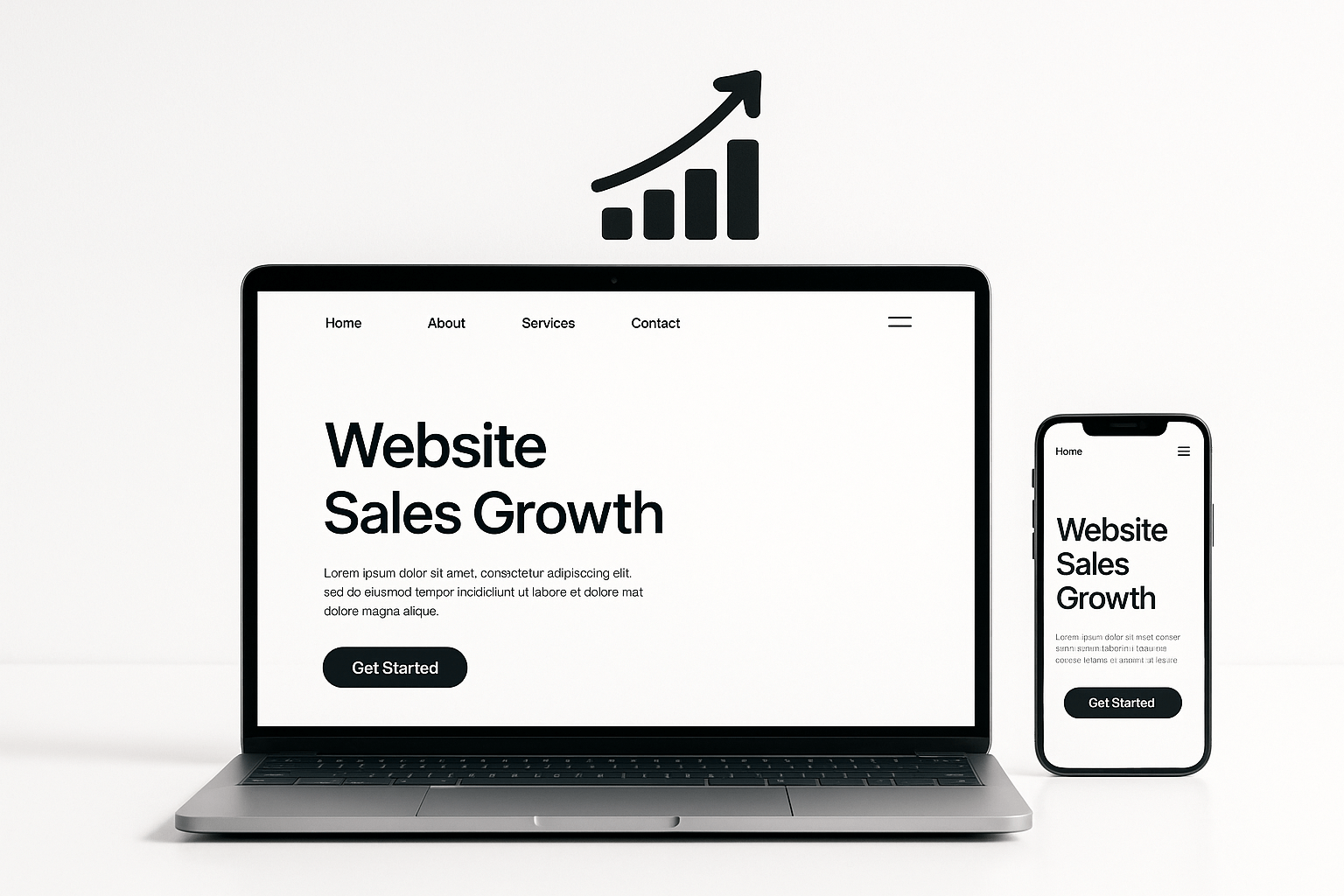
Here’s how you can improve website user experience for more sales: step by step, with practical examples.
Why User Experience Matters for Sales
Think about the last time you abandoned an online purchase. Was the site slow? Did you get lost in a maze of menus? Maybe you couldn’t find the checkout button. You’re not alone. In fact, 88% of online shoppers won’t return after a bad experience, so first impressions really do count.
A smooth, intuitive website builds trust, keeps visitors engaged, and gently guides them to take action, whether that’s booking a call, making a purchase, or sending an enquiry. The bottom line? Better UX leads to more sales.
10 Ways to Improve Website User Experience for More Sales
1. Make Navigation Simple and Predictable
Clear navigation is the backbone of good UX. If visitors can’t find what they need in a few clicks, they’ll leave.
How to fix it:
- Limit your main menu to 5–7 items.
- Use clear, familiar labels (“Services”, “About”, “Contact”).
- Add a search bar if your site has lots of content.
Example: A Newcastle café had their food options under “Our Story.” Changing it to “Menu” made it much easier for customers to find what they were looking for.
Pro tip: Test your navigation on someone who’s never seen your site. If they can’t find your services in under 10 seconds, it’s time to simplify.
2. Speed Up Your Website
People expect instant results online. A slow site doesn’t just frustrate visitors, it costs you sales. Every extra second of load time can drop conversions by up to 20%.
How to fix it:
- Compress images before uploading (TinyPNG works wonders).
- Invest in reliable hosting — cheap hosting often means slow speeds.
- Limit plugins (especially on WordPress).
- Enable caching and use a content delivery network (CDN).
Example: After optimising images and switching hosts, a local electrician’s site loaded noticeably faster, and enquiries started picking up.
3. Make It Mobile-Friendly
These days, more than 60% of people browse on their phones. If your site isn’t mobile-friendly, you’re losing more than half your potential customers.
How to fix it:
- Use a responsive design that adapts to any screen.
- Check button sizes — are they big enough to tap?
- Test forms on mobile (tiny fields = lost leads).
Example: A Newcastle psychologist’s mobile form was too fiddly. After simplifying it, mobile bookings improved significantly.
👉 Not sure if your site is mobile-friendly? Book a Website Health Check with Candor Studios.
4. Use Clear, Compelling Calls to Action (CTAs)
A great website doesn’t leave visitors guessing. CTAs guide them to the next step.
How to fix it:
- Use action words that tell people exactly what to do like “Book a Clarity Call”, “Get a Free Quote”, or “See Our Packages”.
- Make CTAs stand out with colour and spacing.
- Add CTAs throughout — not just at the bottom.
Example: One boutique brand we worked with started adding “Book a Free Consult” buttons throughout their service pages, not just at the bottom. The result? More people started reaching out.
5. Write for Humans, Not Robots
Your copy should be clear, friendly, and customer-focused — not stuffed with jargon.
How to fix it:
- Use short sentences and simple words.
- Speak directly to readers: “You’ll get…”, “We help you…”
- Focus on benefits, not just features.
Example: Instead of “Our platform utilises advanced AI-driven analytics”, try “We use smart tools to help you get better results, faster.”
6. Build Trust with Social Proof
People want proof they’re making the right choice. Show them you’re credible.
How to fix it:
- Add testimonials from happy clients.
- Showcase logos of brands you’ve worked with.
- Share real results (e.g., “Helped 50+ Newcastle businesses grow online”).
Example: A local builder added before-and-after photos with reviews. Leads started coming in more consistently.
7. Make Contact Easy
Don’t make people dig for your details. If they’re ready to get in touch, make it effortless.
How to fix it:
- Add contact info in the header or footer.
- Use a simple form — only ask for what you need.
- Embed a map if you have a physical location.
8. Remove Distractions
Pop-ups, auto-playing videos, or cluttered sidebars pull attention away from your message.
How to fix it:
- Keep your design clean and focused.
- Limit pop-ups to one per visit — and make them easy to close.
- Use white space so your content can breathe.
Example: After removing a busy sidebar and pop-up, a stylist’s site saw visitors spending more time exploring service pages.
9. Test, Tweak, Repeat
UX isn’t “set and forget.” The best websites evolve based on feedback and data.
How to fix it:
- Check Google Analytics for bounce rates and popular pages.
- Ask users for feedback.
- A/B test headlines or CTAs.
Example: A Newcastle event venue tested two booking page versions. The simpler one performed noticeably better.
10. Keep Your Website Healthy
Even the best site can slip if it’s neglected. Maintenance keeps things running smoothly.
How to fix it:
- Update plugins and software regularly.
- Fix broken links and outdated info.
- Run SEO audits to spot issues early.
Example: After a routine health check, a consultant’s site fixed broken links and climbed in Google rankings.
👉 Want peace of mind? Explore our Website Maintenance Packages.
Frequently Asked Questions
How do I know if my website's UX is hurting sales?
Check for high bounce rates, short visit times, or lots of abandoned carts. Ask for honest feedback or book a professional audit.
What's the quickest way to improve UX?
Start with speed and mobile-friendliness. These two fixes often deliver instant results.
Do I need a full redesign?
Not always. Small tweaks like clearer CTAs or better navigation can make a big difference.
How often should I update my site?
Quick monthly checks, plus a deeper review every 6–12 months.
Can Candor Studios help?
Absolutely. We offer audits, copywriting, and ongoing support tailored to Newcastle small businesses.
Conclusion
A great user experience isn’t just a “nice to have” it’s the difference between visitors bouncing away and customers choosing you. From navigation and speed to trust signals and CTAs, every tweak improves your chances of winning more business.
Your competitors are already improving their websites. The longer you wait, the more sales you lose.
 Ready to improve your website for more sales? Book a Call with Candor Studios today and start turning browsers into buyers.